
How Images, Plugins and Themes Affect WordPress Speed

How Images, Plugins and Themes Affect WordPress Speed

A WordPress website can look professional and still feel frustratingly slow. Large images, unnecessary plugins and an overloaded theme are common reasons pages take too long to load, especially for visitors using mobile data or less reliable connections.

Speed matters because visitors usually expect a website to respond quickly. A slow site can make it harder for customers to read your services, submit an enquiry, complete a purchase or find your contact details. It can also create extra pressure on your hosting account and make the website more difficult to manage.

For Nigerian small businesses, entrepreneurs, creators and organisations, the goal is not to remove every image or feature. The goal is to build a useful website that loads efficiently for real customers while remaining attractive, secure and easy to update.

Why WordPress speed is affected by more than hosting

Hosting provides the server environment where your website runs, but the files and software installed on WordPress also influence how quickly a page is delivered. When someone visits a page, WordPress may need to load images, style files, scripts, fonts and plugin functionality before the page becomes fully usable.

A website can therefore be slow because of:

  • Images that are larger than their display size
  • Plugins loading files on pages where they are not needed
  • A theme containing complex visual effects and unused features
  • Too many fonts, animations or third-party services
  • Outdated WordPress software, themes or plugins
  • Limited server resources or an unsuitable hosting plan

Performance is usually the result of several factors working together. Replacing a theme may not solve a problem caused by unoptimised images, just as compressing images will not fix a plugin that performs expensive tasks on every page.

How images slow down a WordPress website

Images are often the largest files on a website. A camera photo or high-resolution design exported for print may be several megabytes, even though the image appears only a few hundred pixels wide on a phone.

When a visitor opens a page, the browser must download those files before displaying them. Larger downloads take longer and consume more mobile data. This is particularly important for websites serving visitors across different devices and connection conditions.

Common image problems

  • Uploading oversized files: A banner displayed at 1,200 pixels wide may not need to be uploaded at several thousand pixels.
  • Using the wrong format: Some images can be significantly smaller when saved in a modern or more suitable web format, while photographs and transparent graphics may require different treatment.
  • Ignoring mobile display: A large desktop image may still be downloaded even when a smaller version would be sufficient for a phone.
  • Loading images that are not yet visible: Images below the first screen can often be loaded when the visitor approaches them rather than all at once.

Before uploading an image, crop it to the shape and approximate dimensions required by the page. Compress it without making the text or important details unclear. WordPress tools or performance plugins may also help create smaller versions, but automatic optimisation should still be checked so that image quality remains acceptable.

For example, a local service business might use a large hero image on its homepage, several staff photos and a gallery of completed work. Resizing the hero image, compressing the gallery and loading lower-page images only when needed can improve the experience without removing useful evidence of the business’s work.

How plugins affect WordPress performance

Plugins add functionality to WordPress. They can support contact forms, security, backups, online payments, search engine controls, email delivery and many other tasks. The problem is not that plugins are inherently bad. The problem is installing more functionality than the website needs or keeping plugins that add little value.

Each plugin may add database queries, scripts, styles or background processes. Some plugins are lightweight, while others perform complex operations. Two plugins that appear unrelated may also load resources on every page, even when their features are used only in one place.

Warning signs of plugin-related slowness

  • The website became slower after a new plugin was installed.
  • The WordPress dashboard is slow as well as the public website.
  • A plugin adds visual elements, tracking scripts or pop-ups across the entire site.
  • Several plugins perform overlapping tasks, such as multiple caching or security functions.
  • Plugins are abandoned, outdated or no longer needed.

Review plugins by asking what business problem each one solves. A contact form that helps customers enquire may be valuable. A complex visual effect that does not improve understanding may not be worth the extra loading cost.

Keep active plugins updated, but take a backup and check compatibility before making significant changes. Deactivate and remove plugins that are no longer required rather than leaving them unused. An inactive plugin is still software that may need maintenance and may create security or management concerns.

Be cautious with “all-in-one” plugins and page-building systems. They can make design easier, but some may add substantial files or generate complicated page structures. This does not make them unsuitable for every website; it means their benefits should be weighed against the performance and maintenance needs of the project.

How themes affect speed and usability

A WordPress theme controls much of a website’s visual presentation and page structure. A well-built theme can provide a clean foundation. A theme packed with sliders, animations, layout options, demo content and bundled features can require more resources than a simple business website needs.

Theme-related performance issues can come from:

  • Large CSS and JavaScript files
  • Multiple font families and font weights
  • Animated backgrounds, sliders and video sections
  • Unused templates and design features
  • Extra layout elements created by a visual builder
  • Poorly maintained or badly coded theme components

When choosing a theme, focus first on the website’s purpose. A company that needs a homepage, service pages, an about page, contact details and a blog may benefit more from a focused theme than from a theme designed to build every type of website.

Design should also support quick decisions. Clear headings, readable text, visible contact information and a straightforward enquiry path are often more valuable than decorative effects. A professional website does not need to be visually empty, but every major element should serve the visitor.

A practical WordPress speed review

When a site feels slow, change one category at a time so that you can identify what helped. A practical review can follow this sequence:

  1. Check the main pages: Review the homepage, service pages, contact page and any important sales or enquiry page on both desktop and mobile.
  2. Inspect image sizes: Find unusually large files, replace oversized images and check whether galleries or banners can use smaller versions.
  3. Review plugins: List every active plugin and record its purpose. Remove duplication and question features that are not contributing to the customer journey.
  4. Assess the theme: Disable unnecessary animations, sliders, fonts and decorative sections where possible. If the theme is difficult to maintain, consider a lighter replacement during a planned redesign.
  5. Check updates and backups: Keep WordPress components maintained, but create a current backup before making changes.
  6. Review hosting needs: If the website remains slow after sensible optimisation, investigate server resources, database performance and whether the hosting plan suits the website’s traffic and features.

Do not judge speed only by how quickly the site opens on your own device. Test important pages using different devices and connections, and pay attention to whether the first useful content appears quickly. A visitor should be able to understand what the business offers and how to contact it without waiting for every visual detail to finish loading.

Performance should support the business, not complicate it

Speed improvements should protect the things customers need: accurate information, trustworthy branding, useful images, working forms and simple navigation. Removing a contact form or important product image just to reduce page size may create a different business problem.

It is also worth considering the wider website setup. Reliable hosting, HTTPS, accessible business email and regular backups contribute to a dependable online presence. Hosting is more than server space: it supports availability, security and the customer experience. If you are unsure whether the cause is a WordPress setting, a plugin, a theme or the hosting environment, practical managed WordPress support can help identify the issue without requiring you to become a server administrator.

The most effective approach is usually continuous maintenance rather than one large emergency fix. Optimise images before uploading them, install plugins selectively, choose a theme that fits the website’s real needs and review performance after major changes.

The useful takeaway: A fast WordPress website is not created by one magic plugin. It comes from sensible image preparation, careful plugin selection, a focused theme and hosting that matches the site’s requirements. Keep the features that help customers, remove the ones that create unnecessary weight, and make speed part of normal website maintenance.
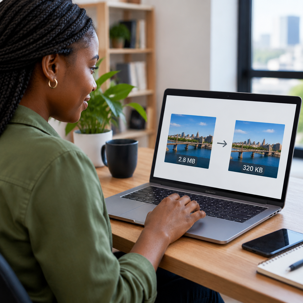
How to Reduce Image Sizes Without Losing Quality

How to Reduce Image Sizes Without Losing Quality

Large image files can make a website feel slow, especially for visitors using mobile networks or limited data. They can also consume hosting storage and make website management more difficult. The challenge is to reduce file sizes without making images look blurry, pixelated or noticeably damaged.

The good news is that image optimisation does not usually require advanced technical knowledge. With the right dimensions, file format and compression settings, you can often make an image much smaller while keeping it clear enough for websites, online shops, portfolios and business pages.

Why image size matters

An image has two different types of size:

  • Dimensions: the width and height measured in pixels, such as 2,000 Ă— 1,333 pixels.
  • File size: the amount of storage the image uses, such as 350 KB or 3 MB.

These are related, but they are not the same. A photograph with very large dimensions will often have a larger file size, but an image can also be made smaller through compression without changing its dimensions.

For a business website, oversized images may delay page loading, increase data usage and create a poorer experience for customers. This matters particularly in Nigeria and West Africa, where many visitors may be browsing on mobile devices or variable connections. A slow page can cause someone to leave before reading your services, viewing your products or submitting an enquiry.

Start with the correct dimensions

One of the most effective ways to reduce an image is to resize it to the largest dimensions the website actually needs. Uploading a camera photograph that is 6,000 pixels wide when the website displays it at 1,200 pixels wide creates unnecessary work for the browser and the visitor’s connection.

Before resizing, consider where the image will appear:

  • A full-width banner may need a wider image than a small blog thumbnail.
  • A staff profile image usually needs much smaller dimensions than a homepage background.
  • A product image should be large enough for visitors to inspect, but not larger than the website layout requires.
  • A logo should be exported at an appropriate size and, where suitable, kept as a vector file such as SVG.

Use the actual display area as a guide. If an image is shown at approximately 800 pixels wide, exporting it at 4,000 pixels wide is usually unnecessary. Keep a high-resolution original separately if you may need it for printing or future editing, and use a resized copy for the website.

Choose the right image format

The format affects both quality and file size. There is no single best format for every image.

JPEG or JPG

JPEG is commonly suitable for photographs, banners and images with many colours or gradual changes in tone. It uses lossy compression, which means some image information is removed to make the file smaller. At a sensible quality setting, the visual difference may be difficult to notice.

PNG

PNG is useful when an image needs transparency, sharp text, simple graphics or clean edges. However, PNG files can be considerably larger than JPEG files when used for photographs. A photographic image saved as PNG may therefore use more storage than necessary.

WebP

WebP is a modern web image format that can provide smaller files while maintaining good visual quality. It can support photographs, transparency and different compression approaches. It is widely supported by modern browsers, although it is still sensible to keep original files and confirm that your website tools handle the format correctly.

AVIF

AVIF can provide strong compression and image quality, but compatibility and editing workflows may vary more than with older formats. It can be useful when your website platform and optimisation tools support it reliably.

A practical rule is simple: use JPEG or WebP for most photographs, PNG or a suitable modern format for graphics that need transparency, and SVG for appropriate logos or icons. Avoid changing formats repeatedly, because each lossy export can reduce quality.

Compress carefully rather than choosing the smallest file

Compression removes unnecessary data from an image. Lossless compression reduces the file without changing the image information, while lossy compression produces a smaller file by discarding some detail.

Lossy compression is often appropriate for website photographs. The aim is not to achieve the smallest possible file; it is to find a useful balance between appearance and performance. If compression is too aggressive, you may see blocky areas, blurred edges, colour banding or visible detail loss.

When exporting or compressing an image, inspect the result at the size visitors will see it. Do not judge only by zooming in to 400 percent. A small amount of detail loss may be acceptable in a thumbnail, while the same loss could be distracting in a large product image or professional portrait.

A practical image optimisation workflow

Use this process whenever you prepare an image for a website:

  1. Keep the original. Save the unedited photograph or design separately so you can make a better version later.
  2. Crop unnecessary areas. Removing empty space can improve the composition and reduce dimensions.
  3. Resize the copy. Set its dimensions based on the largest place where it will be displayed.
  4. Select a suitable format. Use the image type that matches the content, such as JPEG or WebP for photographs.
  5. Compress it. Begin with a moderate quality setting and compare the result with the original.
  6. Rename the file clearly. A name such as lagos-accounting-team.webp is easier to manage than IMG_4821.jpg.
  7. Upload and check the page. View the image on both a phone and a larger screen to confirm that it remains sharp and correctly cropped.

This workflow is useful whether you edit images on a computer, use an online compression tool or rely on image optimisation features in a content management system. If a WordPress website has many existing images, optimisation can be handled in batches, but review settings carefully before applying changes across the entire media library.

Do not forget mobile images

A desktop visitor may see a large hero image, while a mobile visitor may see a much smaller version. Sending the same oversized file to every device can waste data and slow down the page.

Responsive image features allow a website to offer different image sizes depending on the available display area. A well-managed WordPress website can use these features alongside correctly sized uploads. However, responsive behaviour cannot fully fix an image that was uploaded at an unnecessarily large size, so preparing sensible source files still matters.

Common mistakes that reduce quality or performance

  • Resizing by stretching: increasing a small image does not restore detail and usually makes it blurry.
  • Using screenshots: screenshots may contain unnecessary dimensions and interface elements. Use the original file where possible.
  • Saving every photograph as PNG: this can create large files without improving photographic quality.
  • Compressing an already compressed copy repeatedly: edit from the original and export a fresh web copy.
  • Uploading images straight from a camera or phone: these files may be much larger than the page needs.
  • Ignoring the content management system: some platforms create thumbnails automatically, while others may need additional configuration or optimisation.

How to balance quality and loading speed

Quality should be judged by purpose. A detailed image in a portfolio may deserve a larger file than a small decorative image. A product photograph should show important features clearly, while a background image may tolerate more compression because it is not the main content.

Compare two or three versions before deciding. Look at faces, text, fine lines, product edges and areas with shadows. If the compressed version looks the same at its intended display size, there is little benefit in keeping the larger file.

Also consider the rest of the website. Image optimisation helps, but it cannot compensate for an unsuitable hosting plan, an overloaded website or poorly maintained WordPress installation. Reliable hosting, current software, sensible caching and properly prepared media work together to create a better visitor experience.

A simple decision guide

Image type Useful starting point What to watch for
Photograph JPEG or WebP Blurred detail and visible compression blocks
Logo with transparency SVG or PNG Jagged edges and missing transparent areas
Product image JPEG or WebP at the display dimensions Whether customers can inspect important details
Small icon or graphic SVG or PNG Sharpness at different screen sizes

The key takeaway

Reducing image size without losing quality is mainly a matter of preparation: crop what is unnecessary, resize to realistic dimensions, select the right format and compress until the visual difference is no longer meaningful. Keep original files separate, test images on mobile devices and review your website’s image workflow as it grows.

For Nigerian businesses and organisations, these small improvements can make a website more practical for mobile visitors, reduce unnecessary hosting storage and help customers reach important content more quickly. The best image is not the largest or the smallest one; it is the smallest file that still does its job clearly.

Your Cart

©2018 - currentyear Sonhosting • By Digital Nigeria - RC 7487481
All Rights Reserved
Powered by ShootOut Now Services